



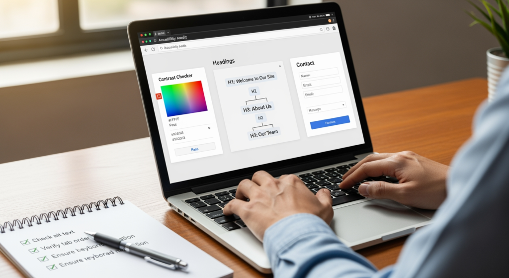
Website accessibility is one of those “invisible” website upgrades that can quietly improve how real customers experience your business online. If you’re a local business owner, marketer, or web designer, this matters because accessibility gaps can block people (and assistive technologies) from using key pages like services, contact, and booking. It can also create friction that increases bounces, reduces form submissions, and makes your site harder to understand for both users and machines.
This checklist focuses on practical, high-priority fixes you can review quickly—then hand off to a developer or implement yourself. If you’re also working on local visibility, accessibility improvements often pair well with technical SEO hygiene, clearer site structure, and better on-page content. For a broader foundation, see Understanding the Importance of Local SEO for Business Visibility.
At a Glance: The Accessibility Moves That Help Most
- Start with the pages that make money. Prioritize your homepage, core service pages, location/service-area pages, and contact/booking pages.
- Fix navigation and forms first. Keyboard access, labels, and error messages are frequent conversion blockers.
- Make headings and links unambiguous. Clear structure helps screen readers and improves scannability for everyone.
- Improve contrast and text sizing. Readability issues are common and usually quick to correct.
- Use alt text where it adds meaning. Describe important images; skip decorative ones.
- Document what you changed. Keep a simple log so future edits don’t undo the gains.
How Accessibility Improvements Support Local Search Visibility
Accessibility is about making your site usable for people with diverse abilities—such as visitors using screen readers, keyboard navigation, voice control, or zoomed text. From a local SEO standpoint, many accessibility best practices overlap with “make your website easier to understand and use” best practices.
For example, a page with clear headings, descriptive links, properly labeled forms, and readable contrast is typically easier for users to navigate. When users can find what they need (services, hours, service areas, contact options) without friction, they’re more likely to take action. And when your site structure is consistent and semantic (headings, lists, labels), it’s easier for systems to interpret your content and intent.

The Real-World Cost of Ignoring Accessibility on Key Local Pages
- Missed leads: If a visitor can’t use your menu, read your text, or submit your form, they may leave and contact a competitor.
- Higher support burden: Confusing forms and unreadable pages can push people to call or message for basic info—if they can find your phone number at all.
- Slower site updates: Without standards, every new page or redesign risks reintroducing the same problems.
- Brand trust issues: A site that’s hard to use can feel outdated or careless, even if your actual service is excellent.
- Compliance risk: Accessibility expectations can vary by context; if you’re unsure what applies to your business, it’s worth getting professional guidance.
Common Accessibility Mistakes to Avoid (High-Priority Checklist)
- ✓ Using “click here” links everywhere — Screen reader users often navigate by links; make link text describe the destination (e.g., “Schedule an estimate”).
- ✓ Skipping heading structure — Don’t jump from an H1 to an H4 because it “looks smaller.” Use headings in order to communicate structure.
- ✓ Relying on color alone to communicate meaning — If errors are only shown in red, some users won’t perceive them; add icons or text cues.
- ✓ Missing form labels — Placeholder text is not a label; fields should have programmatic labels so assistive tech can announce them correctly.
- ✓ Low-contrast text on buttons and overlays — Light gray text on white may look “modern,” but it’s often hard to read.
- ✓ Images with no purpose (or no alt text when they do have purpose) — If an image conveys information (team member, service photo, diagram), describe it.
- ✓ Menus that don’t work by keyboard — Dropdowns and popups commonly trap focus or can’t be opened without a mouse.
- ✓ Unclear error handling — If a form fails, users should be told what happened and how to fix it (in plain language).
Your High-Priority Website Accessibility Action Plan (Do This First)
- ✓ Audit your top 5 pages by traffic and conversions — Start where problems cost you the most (homepage, key service, contact, booking, and a top city/service-area page).
- ✓ Confirm full keyboard navigation — Tab through your menu, buttons, sliders, and forms; ensure focus is visible and nothing becomes unreachable.
- ✓ Fix headings to match page structure — One clear H1 per page, then logical H2/H3 sections that match how a person would scan the content.
- ✓ Upgrade link text sitewide — Replace vague links with descriptive ones (e.g., “View pricing,” “Call our office,” “Request a quote”).
- ✓ Make forms frictionless — Add labels, helpful instructions, and clear error messages; ensure required fields are identified in more than one way.
- ✓ Improve contrast and font sizing — Increase readability on mobile; avoid tiny text, thin fonts, and low-contrast overlays.
- ✓ Add meaningful alt text to key images — Prioritize images that support buying decisions (services, before/after work, staff photos, location photos).
- ✓ Provide accessible contact options — Make phone numbers clickable, ensure address info is readable, and keep contact methods easy to find on every device.
- ✓ Test with a screen reader (quick pass) — Even a short test can reveal confusing navigation, repetitive links, or unlabeled buttons.
- ✓ Create an “accessibility QA” checklist for future edits — A simple internal checklist helps prevent regressions after new pages, plugins, or theme updates.

Professional Insight: The Fastest Wins Usually Aren’t “Fancy”
In practice, we often see the biggest usability improvements come from basics that get overlooked during design—clear headings, descriptive links, properly labeled forms, and keyboard-friendly navigation. Those aren’t glamorous, but they’re the difference between “looks good” and “works for real people.”
When DIY Fixes Aren’t Enough (And It’s Time to Get Help)
- Your navigation or popups are keyboard-trapping. If focus gets stuck in a modal or menu, you’ll likely need developer-level adjustments.
- Your theme or builder limits semantic structure. Some templates make it hard to implement clean headings, labels, and ARIA patterns without custom work.
- You have complex forms or booking flows. Multi-step forms, calendars, and third-party embeds can introduce accessibility issues that need specialized testing.
- You’re planning a redesign. Accessibility is easier (and usually cheaper) to build in from the start than retrofit later.
- You’re unsure about compliance expectations. If risk is a concern, consult qualified legal and accessibility professionals for guidance relevant to your situation.
Frequently Asked Questions About Accessible Local Business Websites
Do I need to rebuild my site to make it more accessible?
Not always. Many improvements—like adding form labels, fixing heading order, improving contrast, and updating link text—can be handled within your current site, depending on your theme and plugins.
Which pages should I fix first for the biggest impact?
Start with pages tied to leads: homepage, top service pages, contact/booking pages, and any high-traffic location or service-area pages. If those are easy to use, the rest of the site can follow.
Is alt text required for every image?
No. Images that convey information should have helpful alternative text. Decorative images can use empty alt attributes so screen readers skip them.
How can I quickly check if my forms are a problem?
Try submitting a form using only a keyboard. Then intentionally trigger an error (leave a required field blank) and see whether the page clearly explains what went wrong and how to fix it.
Will accessibility changes automatically improve my search rankings?
There’s no guarantee. However, accessibility improvements can reduce user friction and strengthen site clarity, which may support better engagement and overall site quality signals over time.
Taking Action Without Overcomplicating It
Use this checklist to focus on the improvements that most often block real customers: navigation, readability, headings, links, and forms. Start with your highest-value pages, make changes in a controlled way, and re-test after updates. If your site is due for a redesign or you’re dealing with complex templates and embeds, bringing in help can save time and prevent repeat issues.
Want More Information?
Download our free resource to learn more about this topic.
